tat Immobilien
Branding & Corporate Identity
tat Immobilien
Branding & Corporate Identity
tat Immobilien
Branding & Corporate Identity
tat Immobilien
Branding & Corporate Identity
tat Immobilien
Branding & Corporate Identity
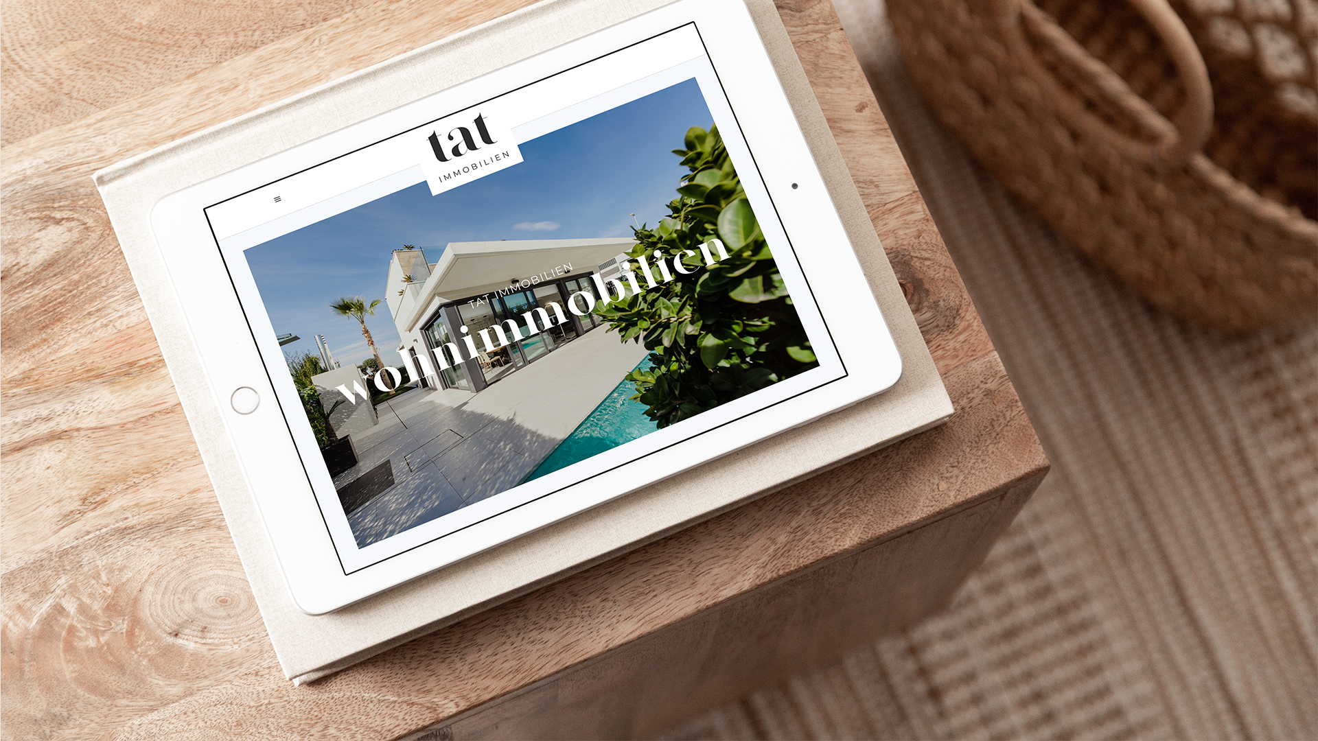
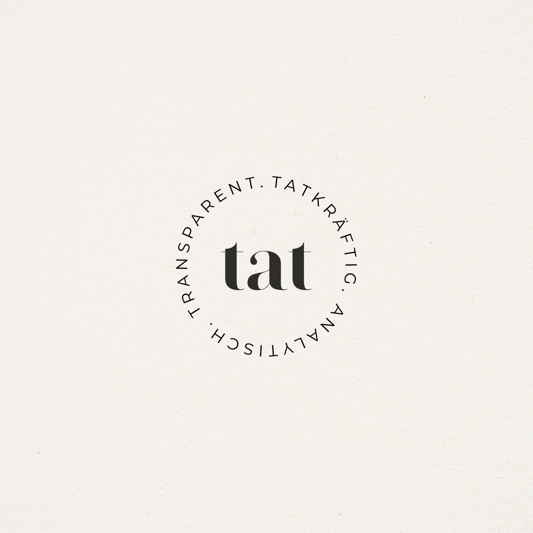
For the Munich based real estate company "tat Immobilien" I created the Corporate Identity and Website. The name "tat" stands for the first letters of the German adjectives: "tatkräftig" = active, "analytisch“ = analytical and "transparent“ = transparent. The services of tat include buying and selling residential properties, commercial properties, real estates and also renting properties.
I chose a clean but luxury serif font for the letters "tat" and decided to use lowercase letters because of the adjectives. The name and font stands for high-value, quality, exclusivity and trust and thus creates a strong recognition value for the brand. "tat" is supported by the term IMMOBILIEN (real estate) for a clear assignment to the real estate industry. The brand colors dark grey, white, gold and creme tones complete the values of the brand.
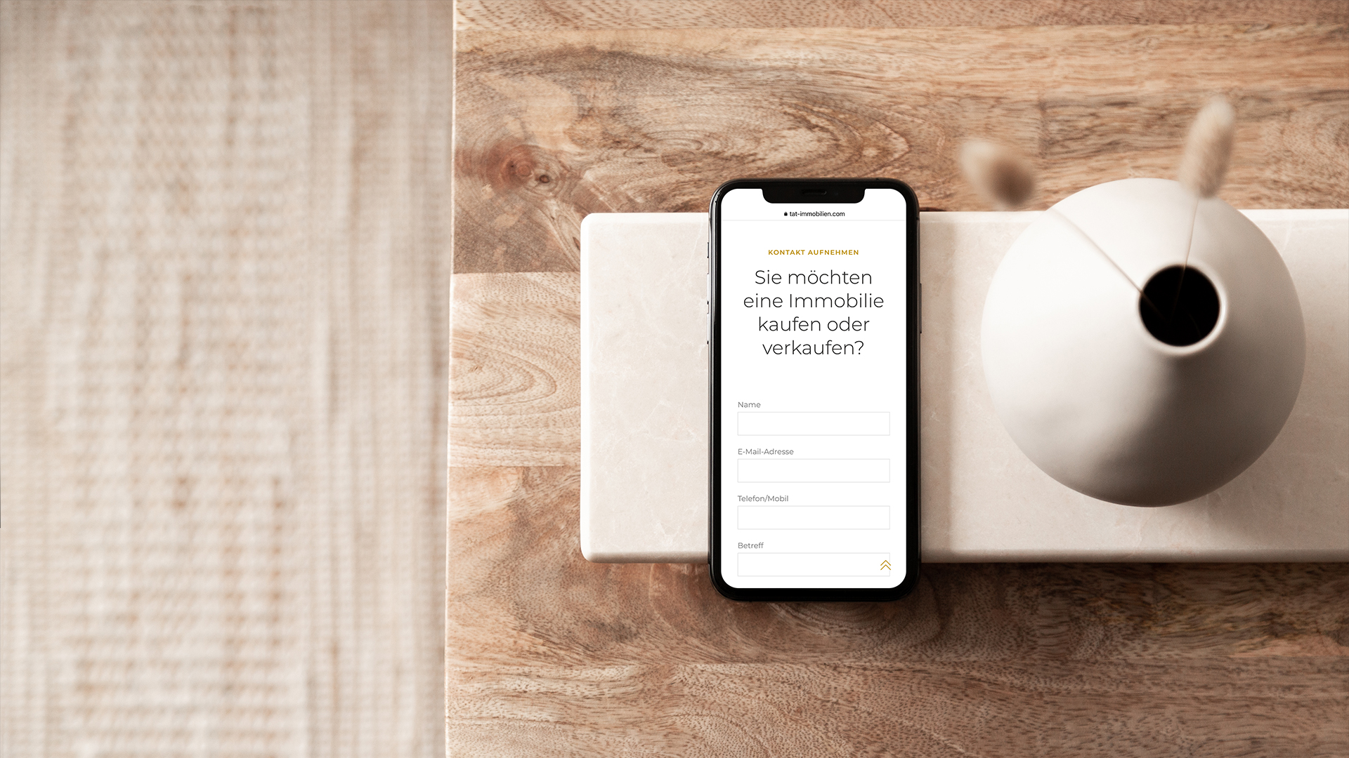
The Website adaptes to the brand design and therefore creates a high-value, luxury and trustworthy impression.
Website
www.tat-immobilien.com
